
We love its versatility – it blends with a host of other colours - and air of calm, which is much needed in our busy lives.
How was the colour chosen?
Every year Dulux paint colour specialists at its Global Aesthetic Centre assemble a team of top international design experts to discuss the new global trends that will affect us all. They help Dulux to understand the mood of the moment and share their insights on the colour trends that will shape the way we live.
Dulux’s colour experts then get to work choosing the best colour to reflect those findings, a shade that will feel ‘just right’ in homes for years to come.
Over the past 18 months, our lives have been turned upside down, but we’ve also had time to rethink the way we live and reassess what’s really important. Discussion this year included the expanding role of the home and how nature is essential to our lives.
Key themes of open skies and a breath of fresh air dominated the conversation.
Why Bright Skies?
Heleen van Gent, who chairs the ColourFutures panel, says: “Bright Skies, the Dulux colour of the year, is a light, airy and optimistic shade that encapsulates a breath of fresh air. Vibrant colours and light tones are re-emerging - a reflection, perhaps, of our need for positivity and a fresh approach."
“After a spell of feeling shut in, we crave expansion - the great outdoors.”
How to use it in your home
Blue is a receding colour, which means that it looks further away from us when it's on the walls. Using any blue in a room will make it feel more expansive but a pale clean sky blue, like Bright Skies, will help to melt the walls away and reconnect with the biggest space of all – the sky itself.
You can use Bright Skies to brighten up your home and give it a clean and fresh look.
Using it in smaller areas will give the feeling of increased space and make any room appear bigger than it is; you can use it to brighten up a living room recess or alcove, and you can even use it on the ceiling to create the impression of a cloudless summer sky, really bringing the outdoors in and generating an impression of height and freedom.
Dulux also has a range of complementary palettes to co-ordinate with Blue Skies.
How Redrow has been inspired by Bright Skies in our show homes?
Alysha Alli, our head of interiors, says: “Bright Skies is a fresh, delicate blue that’s good for the soul and it sets a hopeful tone for any space in the home.”
“Its versatility lends itself to any room - and we have certainly taken advantage of that - we think it’s especially ideal for those hub areas in family homes, like the kitchen, dining and family space, where it creates a sense of peace and calm in what can sometimes be a busy and hectic area.”
Light blue tones like Bright Skies sit well next to a white wall to create a clean and crisp backdrop, and the fresh and airy look is accentuated when the sunlight streams through windows and patio doors to reflect its light and warmth. That’s a look that can be further enhanced when paired with a tonal kitchen and complementary accents of furniture, such as a statement dining table, a skinny console or chunky sideboard.
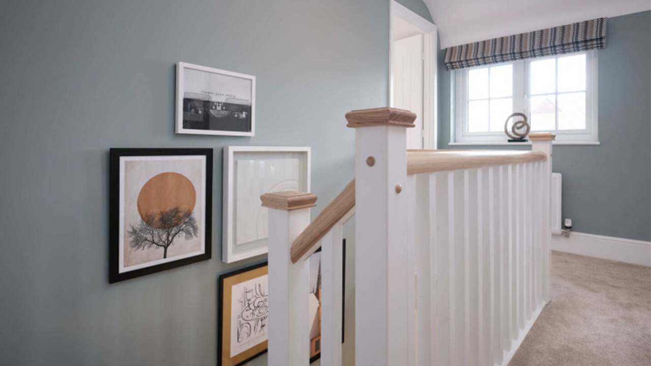
As a feature wall, Bright Skies can provide the perfect background for photos or artwork, allowing them to stand out and attract attention, while helping to accentuate statement accessories, especially those that are darker and dramatically different in colour or texture.
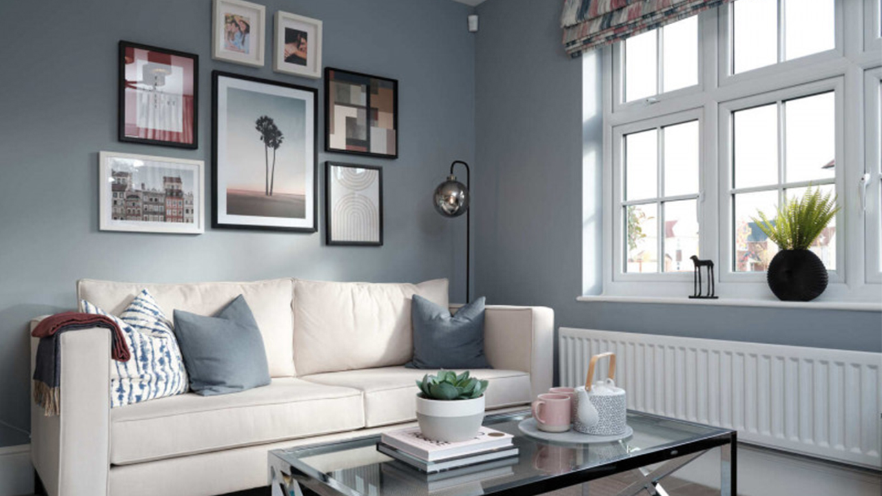
In the lounge, a colour like Bright Skies can create a relaxing atmosphere in the room where many of us go to unwind and chill. “As a paint shade it can brighten up an alcove, add light or simply inspire dreams of summers to come; but we also use it as our inspiration for soft furnishings, cushions, ceramics and other accessories, all of which can contribute towards that tranquillity and complete the overall look,” Alysha adds.
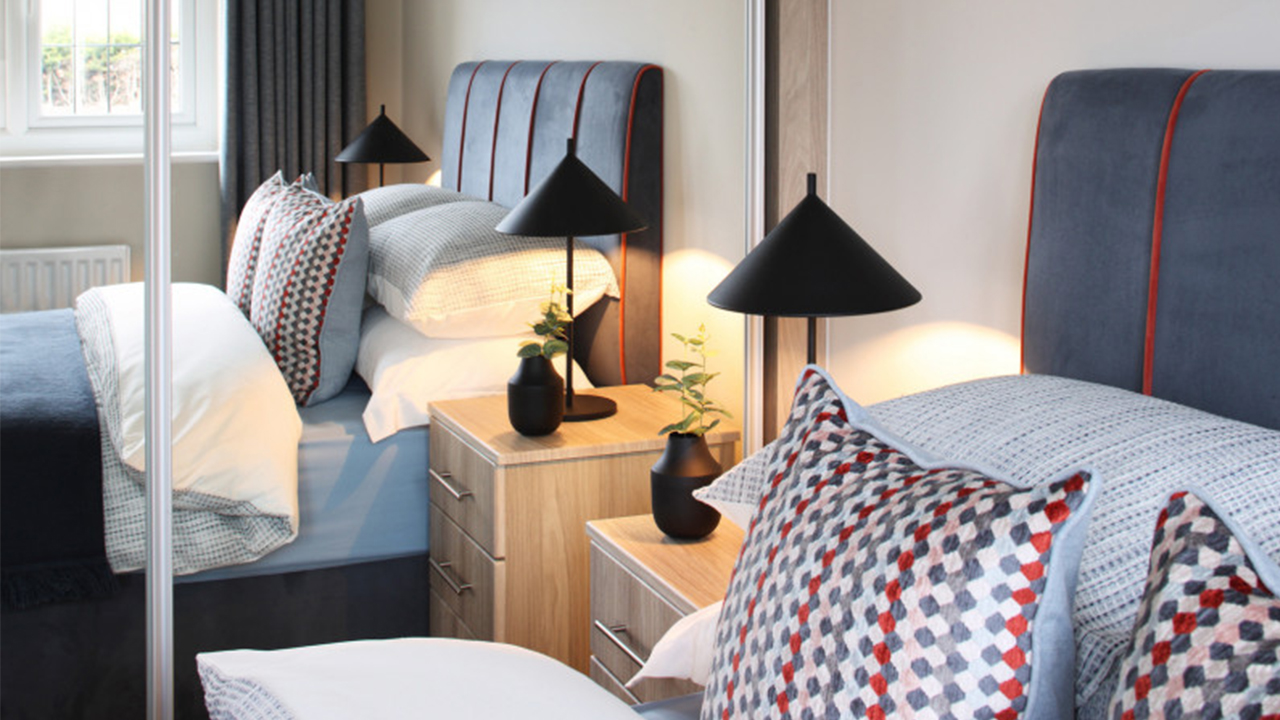
Promoting serenity and restfulness, light and airy blue is also a great colour for the bedroom. It can be wrapped around the room to offer a bright and breezy look that anyone would look forward to waking up to. It also contrasts beautifully with darker shades of feature paint, and sits alongside rich, deep tones such as inky blue statement headboards or accent black accessories like a statement bedside lamp or oversized ceramic vase.
The connection to nature means pops of greenery look great against Bright Skies – in any room.
If you'd like to take a look at our beautifully-designed show homes, visit a Redrow development near you.
You may also like:
-

- Nov 28, 2025
Love lounging
-

- Nov 28, 2025
Tips on perfecting your Christmas table décor
-

- Nov 26, 2025
2026 Interior Design Trends


